A Graphic Look at SXSWi 2009
Samantha Warren, Former Viget
Article Category:
Posted on
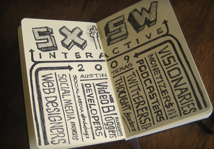
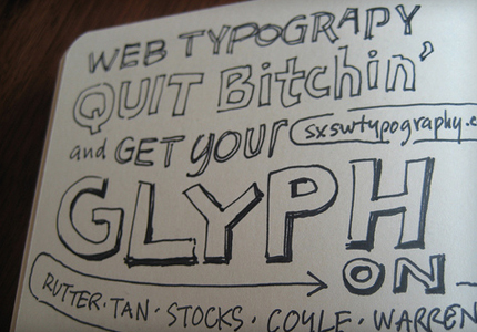
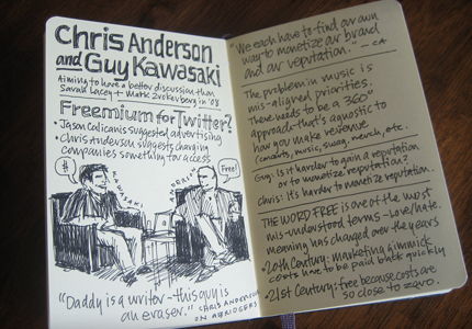
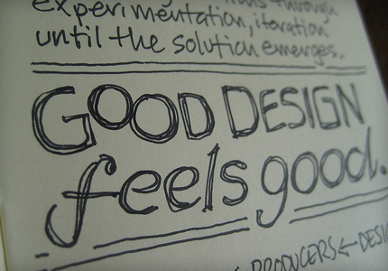
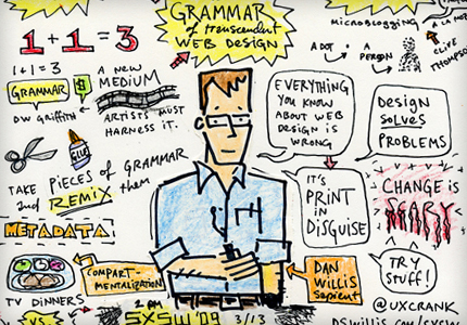
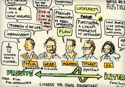
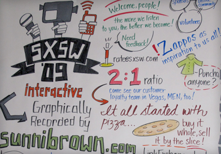
Sharing notes at this year's conference went beyond Twitter -- there were a few folks at the SXSW Interactive Conference who took sketchnotes. Sketchnotes are elaborate notes with handwritten lettering and sketchy drawings of what is happening during the talk. They are an artform; a combination of comic strip and information design. It takes a good listener and fast illustrator to get down a good sketchnote. The popularity of taking sketchnotes has grown and many people are now scanning in the pages of their moleskin and uploading them to flickr. I thought I would share with you a few of my favorites from this year's conference.
I have seen them online and at the conference before, but this year Mike Rohde's sketch really caught my eye when I saw he had been sitting in the audience of my panel, "Web Typography: Quit bitchin' and get your Glyph on." I personally really enjoy the irony in his fantastically crafted hand lettering inspired by a talk on Web Type. His work has been getting a lot of deserved publicity; he has a very extensive flickr set that covers many of the design related panels at the conference. I recommend you check them out.
Sketchnotes by Mike Rohde
Sketchnotes by Austin Kleon
Sketchnotes by Sunni Brown
Sketchnote by Varick Rosete
For more sketchnotes, check out these Flickr Sets
Mike Rohde's Complete Collection
The Joy of Sketch- Adaptive Path
Photoshop World Orlando Sketchnotes
Know of any more? Post them in the comments!
