8 Faces: Viget
Steve Schoeffel, Former Designer
Article Category:
Posted on
Why?
Typography is very central to the work we do as designers. There are many tools and techniques. There is much history. And as we all know, the world of web-type these days is developing rapidly on a day by day basis.
Recently at Viget, we decided to conduct our own internal version of 8 Faces to figure out the collective typeface preferences of our design team. There were a few reasons for this:
- Curiosity: we were interested to know which typefaces would rise to the top
- Simplicity: with a font library in the hundreds and thousands, it begs the question, how many are truly irreplaceable?
- Efficiency: this is probably a secondary reason but it has come up before that it may be useful to have a list of solid, tried-and-true typefaces that we could use as a starter set for new hires and interns
How We Got the List
Here is how we decided which would make the cut:
- We had everyone submit their top eight typefaces*, in order of importance. They did not have to be available yet on the web – this was due to time considerations and also because we wanted to see what the top choices were, period. Then afterward, we'd worry about pricing, implementation, and availability.
- We developed a point system (1st place: 9 points, 2nd place: 8 points, 3rd place: 7 points... 1 point for each Honorable Mention that was listed but not in someone's official Top 8)
- The team was asked to include six "workhorse" typefaces and two that had more specific uses or unique characteristics. Due to this stipulation, the results were generally swayed in the direction of being more multi-use and less eccentric or display focused.
* Disclaimer: Helvetica is not officially on the list but is certainly well-loved by our design team, especially Rob Soulé.
Our Top 8 Selections
1. Din
- Sans serif, Grotesque
- Designed by Johannes Erler in 1925 in Germany
- FF Din was designed in 1995 by Albert-Jan Pool
- Web Availability: Fontfont, MyFonts, Fontdeck, MyFonts , Typekit (Din Condensed)
- Usage samples:

2. Univers
- Sans serif, Transitional
- Designed by Adrian Frutiger in 1957
- Web Availability: Fonts.com (Professional Plan)
- Usage samples:
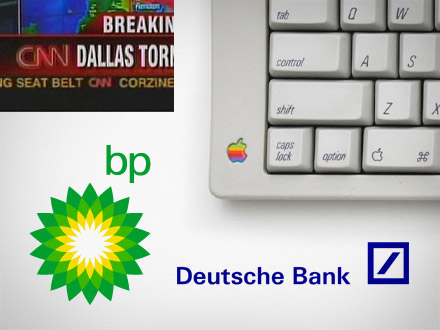
3. Franklin Gothic
- Sans serif, Grotesque
- Originally designed by Morris Fuller Benton in 1902
- Web Availability: Fontdeck, Typekit, My Fonts, Fontspring (Franklin Gothic FS)
- Usage samples:
4. Meta
- Sans serif, Humanist
- Designed by Erik Spiekermann in 1986
- Web Availability: Typekit, FontFont
- Usage Samples:
5. Gotham
- Sans serif, Geometric
- Designed by Hoefler & Frere-Jones in 2000
- Web Availability: Not currently available
6. Trade Gothic
- Sans serif, Transitional
- Designed by Jackson Burke in 1948
- Web Availability Fonts.com (Trade Gothic Next)
- Usage samples:

7. New Century Schoolbook
- Serif, Transitional
- Century Schoolbook was designed by Morris Fuller Benton in 1919, consolidating and refining the original designs done by his father Linn Boyd Benton
- New Century Schoolbook was designed by David Berlow for Linotype
- Web Availability: Fontdeck (Grad, a digital variant designed by Mark Simonson), MyFonts (Century Schoolbook ++URW), Fonts.com
- Usage examples:

8. Bodoni
- Serif, Didone Modern
- Designed by Giambattista Bodoni in 1798
- Web Availability: Fontdeck (Bauer Bodoni), Fontspring (Bodoni FS), Typekit (LTC Bodoni 175), MyFonts, Fonts.com
What Would Be on Your List?
These typefaces came only from the input from our team. It's likely that almost every single person would have something slightly (or even majorly) different on theirs. What about you?
