How to Create More Accessible Content, Part 1: Copywriting

Megan Zlock, Former Front-End Development Director
Article Categories:
Posted on
Writing consistent, well-structured copy that serves all audiences.
When creating a website, I put a lot of effort into making every feature and every piece of content on the site as accessible as I can. Keyboard navigation should be made easy for those with mobility challenges. The code I write should be clean so that it’s easily parsed by a screen for the common man or a screen reader for the visually impaired (among many other devices). There should also be fallbacks present when one form of media just won’t work for everyone and their individual needs.
You may not understand exactly what I’m talking about or what I do to achieve these things, but if you’re managing a website, you should be invested in the accessibility of your website and your content... which I freely admit this can be really, really hard. Just knowing what needs to be done is difficult as you have to dig through tech jargon and accessibility gobbledygook to find the few rules you should really care about as a Content Manager (or Copywriter, Website Administrator, whatever your title may be).
So let me pick apart the gobblegygook and give you some specific to-dos to keep your site accessible:
Writing More Accessible Copy
If you ever hear a developer say something that sounds like “Wizzy-wig,” this is the thing they’re talking about:
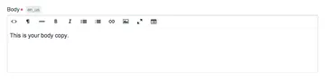
You’ll likely see this interface or something very much like it when you log in to a Content Management System (CMS) like Craft, WordPress, Drupal, or ExpressionEngine to edit or write new content for your website.
What WYSIWYG (pronounced Wizzy-wig) stands for is “What You See Is What You Get.” So, a WYSIWYG editor shows you exactly what your content is going to be on the published page of your website. Words that you have bolded will in fact be bold, lists will appear as lists, etc, etc.
This is where your copy lives. This is where your content is imported into the system. Simply put, this is your domain. Own your content in the WYSIWYG and make it accessible by following these tips:
1. Be consistent with language

As an example, we have two buttons pictured here. One says “Buy Now” while the other says “Add to Cart.” As a person with relatively good vision and understanding of the web, I can assume that these buttons do the same thing, given the context clues of the orange color and the shopping cart icon.

However, once you strip away the visual characteristics of the buttons, they have nothing in common. A screen reader user would have a harder time discerning that these buttons have the same purpose. Use the same language throughout your site to make this obvious to everyone.
Of course, this rule is just a general good practice. If you have “social causes” on one page of your site, don’t call them “issues” on a different page. If there are more contributors to your web content than just yourself, make sure everyone is using the same language by creating a style guide.
2. Don’t Rely on Visual Characteristics
Piggy-backing off of the previous example, let’s say you want to direct your user to that “Buy Now” button in your copy. Don’t write something like, “To attend our event, click on the orange button to buy a ticket.” To the blind or colorblind, “orange” can be a much more abstract concept that is hard to identify.
Also avoid sentences like “click on the button on the right,” as this is also a visual indicator and that button may not always be “on the right” if your site is responsive. It might be in a completely different place on a mobile device.
3. Write Good Links
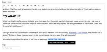
Fairly often on websites, you’ll see a simple “Read More” link at the end of a blurb or article. While these are visually minimal, they are terrible for accessibility. When creating links, make sure it’s obvious where a link will take you. It’s best if the text in the link conveys where you will be taken outside of the context of the surrounding paragraph, but if there are surrounding text clues in the copy that’s ok too.
Instead of Read More, write Read more from Viget. Or, even better, Read more from Viget on our Blog. As a bonus, the longer link is easier to tap on mobile devices where text is small and your fingers are fat.
4. Keep Heading Structure in Mind
While writing your copy, it’s common to divide some topics up into different sections with headings (as I’ve done above with “Keep Heading Structure in Mind”). Usually you’ll find these headings in your text editor’s Formatting tab. When using a screen reader, these headings aren’t just for show. Users jump between them and use them to scan the content of your website. That makes it important to try to use them correctly.
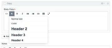
Each heading is associated with a number, so you’ll have Heading 1, Heading 2, Heading 3, and so forth. These numbers convey a certain hierarchy when used; for example, you may use a Heading 2 as the title of a section and then you should use a Heading 3 for each subsection following and so on.
Try to follow these conventions regardless of what the Heading looks like (although you might like that red color on the Heading 4 way better than that Heading 3). If you don’t like how the styles of your headings flow, then talk to your developer and we can switch it around for you.
Also, keep in mind that Heading 1(s) are a big taboo inside of page copy. Your page or article title should be your Heading 1, so headings inside your text should start on the Heading 2 level. I tend to disable Heading 1(s) in the text editor to avoid any issues, but sometime little details like that can slip through the cracks on other sites.
5. Write Simply to Maximize Your Audience
So far, what we’ve discussed fits into the lower levels of Web Accessibility (Level A or AA), as dictated by WCAG 2.0 guidelines. When you go up to the highest level of accessibility, Level AAA, then you have to write for a far larger audience and landscape of ability. People with cognitive problems, attention problems, those who are reading a secondary language, or even just young students are factored in here.
Simply put, the specification states to avoid idioms, jargon, or abbreviations, since your reader may not know theses words or phrases. If you do use words that could be defined as idiom, jargon, or abbreviation, then make an effort to define these terms. Language should be kept simple, clear, and brief so that it can be understood by as many users as possible regardless of their cognitive abilities, cognitive state (hey, we all have those days), level of fluency, or education level. Sadly, humor may be out as sarcasm, parody, and metaphor can be problematic as well.
The specification states that you should write for a lower secondary education level.
To Be Continued…
“But what about other media?,” you may be asking. Afterall, content managers are in charge of far more web content than just simple copy.
Images, video, and audio are each their own beast when it comes to web accessibility and it can take a lot of consideration and dedicated time to make them accessible. To address each content type properly, I’ll be writing a (soon to follow) Part 2.