Duke Admissions Redesign: 5 Key Goals
Jason Toth, Former Experience Design Director
Article Category:
Posted on
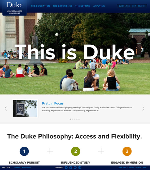
The last time that Duke University redesigned their admissions website was in 2005. The web has grown up a lot since then, and Duke asked Viget to help them make a monumental shift in how they approached admissions online. The previous admissions site was text and content heavy, lacked organization, and it wasn’t an engaging representation of Duke’s quality and spirit. We needed to find a way to simplify the content and project an accurate picture of the Duke campus, student body, and brand.
When we began this project last fall, our focus was on a few key goals:

1. Remember the audience
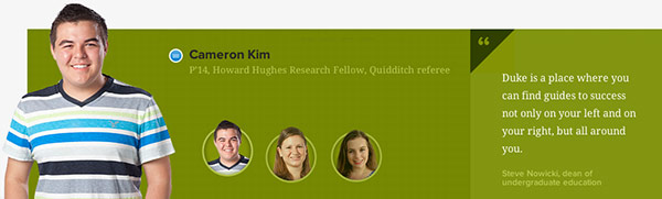
Learning how to speak to a teenage audience is one of the most difficult challenges for any Admissions office. Translating educational philosophies, value, and complex academic programs into a language that astute teenagers find interesting or informative takes careful consideration. By capturing the attention of students through strong imagery, videos, student stories, and content written in terms they understand, we were able to address the specific goals of this audience in a meaningful way.
Some of our target tasks were:
- Lead pages with content that is relevant, inspirational, and engaging to prospective students
- Translate key value propositions into simple, relatable messages
- Define a site architecture that addresses prospective student interests rather than the internal organization structures
- Invest considerable attention to capturing the experiences of Duke students
2. Show, don’t just tell
The Duke team frequently cited an endless array of examples, statistics, and stories that brought life and validation to their educational values. We quickly realized these would be the foundation of the Admissions site. Building off of a set of core brand pillars, we underwent an arduous process of documenting academic and environmental examples, specific student accomplishments, statistics, and university stories that convey Duke's core messages. Our goal was to design a series of pages that were crafted around the content, not the other way around.
Some specific approaches were:
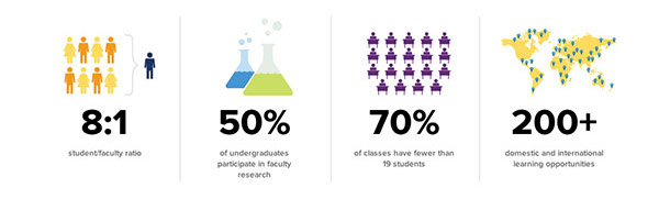
- Heavy use of visual statistics and imagery
- Variation and scale through typography and imagery
- CMS-backed collection of stories that Duke can map to any piece of site content
- Limited occurrences of pages with significant text blocks
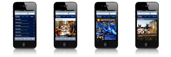
3. Make it mobile
Previously, the Office of Undergraduate Admissions had neither a mobile-optimized site nor a mobile app for their visitors. With approximately 8% of all site visits coming from a mobile device, the site redesign also included the first phase of a mobile strategy to create a more compelling mobile presence. The new mobile-optimized site provides a foundation for future mobile communication with students and centers around 3 core functions:
- Assist visitors traveling to Duke (provide directions, access campus maps and parking locations, book tours, accommodation information)
- Introduce prospective students to Duke (majors/minors/degrees, academic paths, quick facts, top 10 list)
- Access core elements of the application process (deadlines, required documentation, links)
The mobile site also mirrors many aspects of the website design strategy which highlights inspirational content through compelling imagery, core statistics, student bloggers, and key brand messages.
4. Simplify
A recent statistic shows that web users read only 50% of the words on a page containing 111 words or less and only 28% for pages averaging ~600 words. Taking this into consideration, we took a very aggressive strategy to simplify the navigation, copywriting, and overall content presentation.
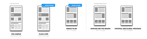
We reorganized the site into 4 main site sections, reduced the overall site architecture from 115 pages to 26 pages, and eliminated redundant content or content managed by other groups within the University. This approach made the site more focused and consumable while vastly reducing the recurring site maintenance.
Here are a few of the strategies we used during this process:
- Created a series of relationship diagrams to map out content associations. These later evolved into the the site's architecture.
- Created numerous instances of tabbed sections of body copy. This approach grouped related content, reduced the number of pages with large blocks of copy, and reduced the overall number of site pages.
- Limited site navigation to a sticky footer and header which eliminated the need to have repetitious navigation in the body of a page
- Limited the fragmentation of content across multiple pages. Instead, we designed engaging, long pages that flow and tell a story, giving careful attention to grouping content into brief, focused sections.
5. Innovate
Innovation does not occur in isolation, nor can it develop without boldness and trust. The Duke team was committed to this approach as active, collaborative, risk-takers. They issued a challenge for Viget to design an Admissions site that would be creative, pioneering, and reflective of the innovative spirit at Duke. In order to meet this challenge, we were determined to make the site fresh and rich at every level and on every page by crafting content, visuals, and interactions that all reflected innovation and Duke's core brand messages.
Some specific examples of this are:
- Use of detailed content templates and flexible page archetypes
- Implementation of an animated sticky footer and header that eliminates the need for page navigation, providing a large canvas for rich, magazine-type page layouts
- In-page URLs and page tabs allowing admissions officers quick reference to key content
- Creation of a ‘story layer’ that is managed by the CMS, providing the flexibility to map stories to any piece of content on the site
- Development of Viget's first commercial ExpressionEngine add-on, Single Entry
Our collaboration with the Duke team was critical to our success on this project. We were thrilled to partner with both the Office of Undergraduate Admissions and the Office of Public Affairs and Government Relations to launch the sites. Congratulations to the Duke team!
Want to learn more? Read more about our process on our Work page, and the press release from Duke announcing the new site.