Constructing Split Tests with Stanley Black & Decker
Paul Koch, Former Data & Analytics Director
Article Categories:
Posted on
For more than two years, Viget’s digital analytics team has been working with Stanley Black & Decker, the company behind brands including Black & Decker, Dewalt, Porter Cable, Stanley Tools, and Bostitch. We’ve partnered with their team in analytics-specific engagements to make their digital efforts as measurable as possible and to enable better data-driven decisions.
Recently, we’ve been working with SB&D to improve the effectiveness of their existing sites through split testing, and we're excited to share some examples -- some of which have led to six-figure impacts in online revenue.
A quick primer on split testing: we create different variants of a page, then randomly serve a particular version to each visitor. We set a cookie so that users don't see multiple versions of the same page and get confused. Measuring the percentage of visits who view each version and ultimately complete our site goals, we can determine a “winning” page. We just need a difference in conversion rates and enough visitors to minimize the possibility -- beyond a specific statistical threshold -- that the difference in conversion rates is the result of random variation.
Now, let’s get to the tests!
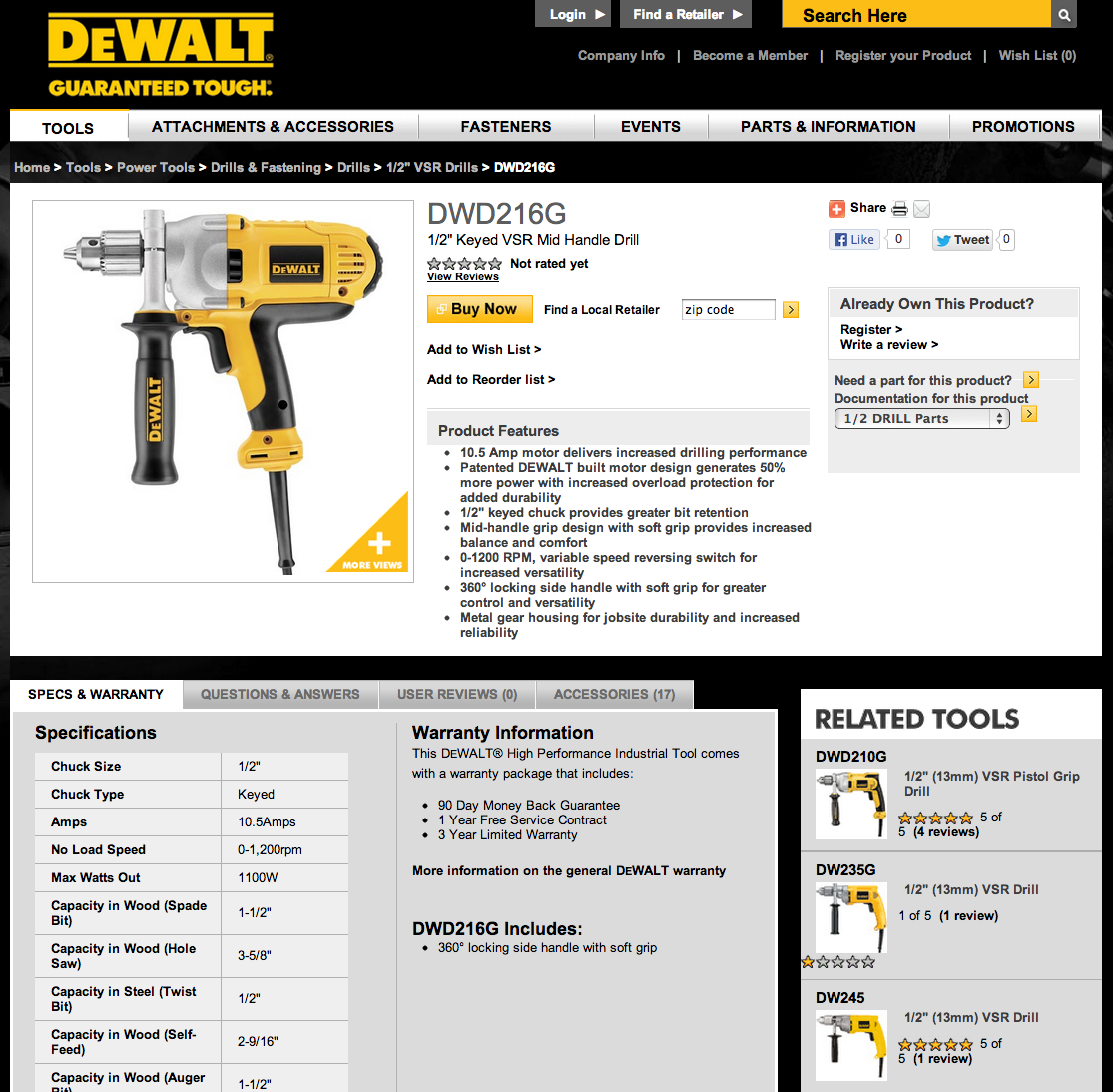
A Dewalt test compared two calls-to-action on product pages: “Buy Now” vs. “Shop Now.” The button opens a window containing links to vendors that have the product in stock, such as Lowe’s and Home Depot. To us, “Shop” seemed like a less-committal action, which might have caused more people to click the button, but it also implied a longer process to purchase -- we weren't sure.
Test #1
Version 1:
Version 2:
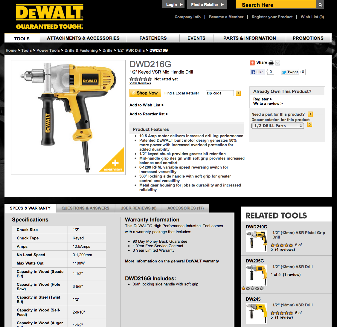
Result: “Buy Now” drove 17% more people to click to vendors than “Shop Now.” Projected over the course of the year, this single, small decision has a six-figure impact in online revenue -- so it’s a good decision to get right!
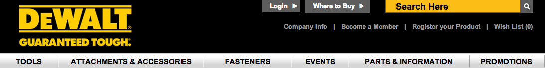
Test #2
Another Dewalt call-to-action test aimed to help more people use the site’s functionality to find local retailers. We tested three naming differences in the top navigation: “Find a Retailer” (the original version), “Where to Buy”, and “Nearby Retailers.”
Version 1:

Version 2:
Version 3:
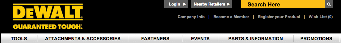
Result: Both of the new versions actually outperformed the original; but, the big winner was “Nearby Retailers”, which sent 4.1% more visitors to use this functionality. Thinking about it afterwards, the result made sense: “Nearby Retailers” was the only one that indicated a physical location. “Find a Retailer” and “Where to Buy” could have both related only to online retailers -- so the winning version helped clarify.
Even when we make conservative assumptions about the percentage of people who ultimately go to a nearby store, and the average amount they spend, the increase in revenue thanks to this test is remarkable.
Test #3
We also tested the Dewalt Promotions page. Originally, the page included only a product name, photo, and link to buy. The team had been bulking up the page with additional information, including text details about the product, user reviews, and outbound links to watch product demos on YouTube. They wanted to understand the effects of these additional efforts.
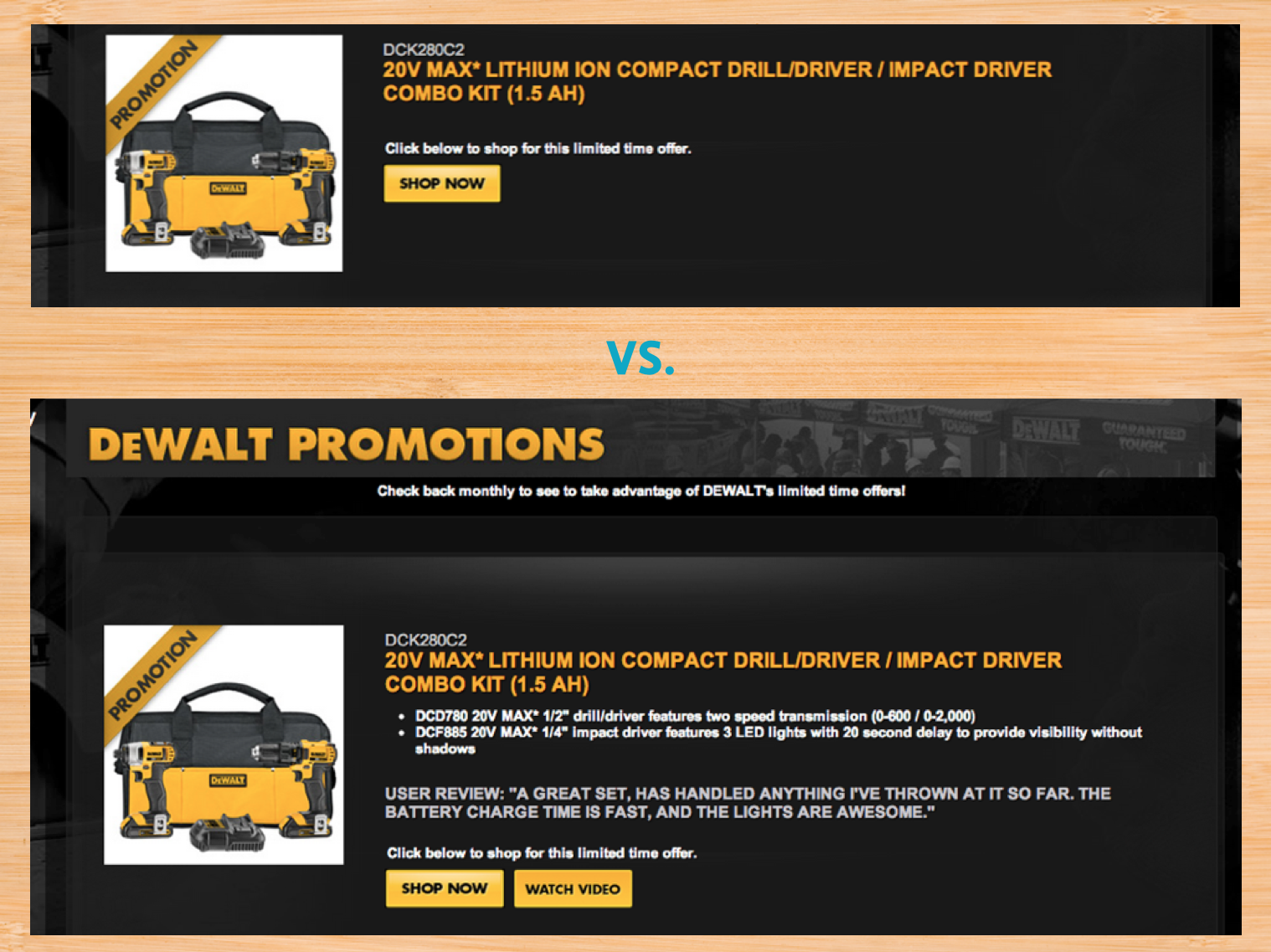
Result: Surprisingly, the more streamlined version drove clicks to outbound retailers 26% more effectively. As a result, the team had a more effective page while needing to curate less content.
We did debate whether users were clicking the simpler version’s call-to-action more just to find out more about the product. Since we couldn't measure which version people saw on these third-party retailers’ sites, we had to be satisfied that we were doing our part -- sending the traffic -- in as high a volume as possible.
Test #4
We’ve also tested other brands: a test for Black & Decker was particularly interesting. Some people suggest that users commonly scan pages in a “Z” pattern, eventually ending toward the lower right-hand corner.
The existing Black & Decker product detail page showed attachments, accessories, and related products in the right rail:
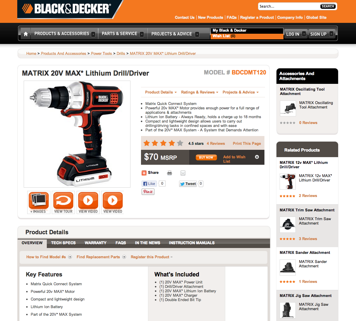
Black & Decker wanted to test how strong this “Z” scanning pattern actually was, by moving associated products to the opposite side of the page, which would bring the “Buy Now” button closer to the end of the user’s scan:
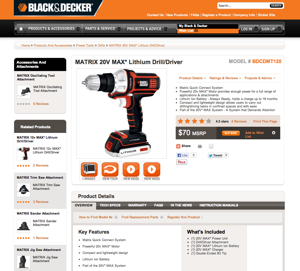
Result: After testing more than 100,000 visitors, we concluded that it made no difference at all! People clicked to Buy Now in almost identical frequencies on each of the two versions. “No results” don't mean “bad results”, though -- we knew not to spend time debating this design decision!
What’s the takeaway from all these tests? Should your links always say “Buy Now” and “Nearby Retailers”? A frustrating (and fascinating) trait of digital marketing is the lack of many universal truths. What worked for Stanley Black & Decker and their audience may have completely opposite results for yours. So ... test it!