Smoothing Responsive Designs with +spread

Doug Avery, Former Senior Developer
Article Category:
Posted on
A new technique for tweening styles between your CSS breakpoints, automatically.
Building for “breakpoints"
One of the hard parts of building responsive sites is making decisions about the between-states — that is, what a page looks like when it’s not Xpx or Zpx wide, but Ypx. Sometimes you only have two or three design documents about a single component to build off, leaving you with big gaps in which you have to reason about how to pad, size fonts, etc. How do you decide what to do in the middle?
Bridging the gap
On the mobile-size comp, a component is padded at 10px, but the wide-screen one is padded out to an airy 50px — what do you do on tablets? You’d probably keep the 10px up until a “desktop” breakpoint like 1024px, then switch to 50px. Maybe you’d have an in-between value of 30px at some point, but you’d have to do the math on where to put it yourself, and you’d have to repeat that logic anywhere you wanted to match the 10-30-50 ratio.
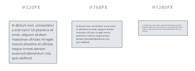
And you’re still stuck with gaps — window sizes at which you have to pick either/or, and at which the design balance is still subtly thrown off:
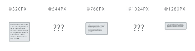
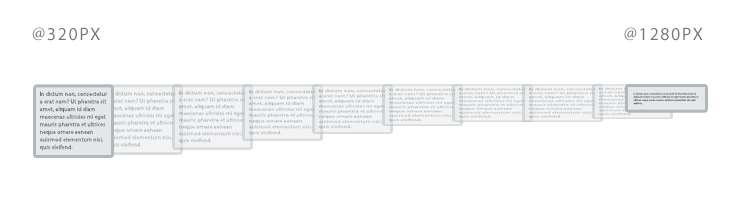
In a perfect world, you’d want the padding to just stretch between 10px and 50px based on window width, right? That way the spacing and breathing room on the page is consistent across all device sizes. It might even be what you imagined it would turn out like when you were designing, but unfortunately, CSS just doesn’t work that way….OR DOES IT!?
+spread
This is where +spread comes in — a small Sass mixin that takes min/max values for a property and generates media queries that evenly spread the values across your screen dimensions. It’s surprisingly easy to use, and surprisingly powerful. Spread can:
- Distribute values in any numeric format — px, em, percent, and floats (like opacity)
- Generate min-height, min-width max-height or max-width queries
- Be as precise as a single pixel of window height/width, or as broad as setting a property once every 500px
- Ease values between min and max for more precise control
Before reading any further, check out the demo page: http://codepen.io/averyvery/full/vEygoP/
How do I use it?
Spread has nine arguments, which can make it a little daunting at first:
- $property: CSS property to set
- $property-min: Min value of the property
- $property-max: Max value of the property
- $dimension: Media query dimension — min-width, min-height, max-width, or max-height
- $dimension-min: First media query of the chosen dimension
- $dimension-max: Final media query of the chosen dimension
- $default-value: True/false (defaults to true). Should a default value (min for min-width/height, max for max-width/height) be included outside the query?
- $precision: How many pixels each media query should cover
- $ease: Easing function to use when calculating value. Helpful for fine-tuning some widths in the mid-range. Here’s a demo of how they work.
I find the easiest way to use +spread is to create some helper mixins that set a few defaults. Example:
=spread-width($property, $min, $max)
  +spread($property, $min, $max, min-width, 400px, 1850px, $precision: 100px, $ease: in-quad)
You should be able to use this mixin alone to do most of spread’s work, and I find that creating named helpers like this make the code more expressive than calling +spread with 5-7 arguments can be.
What can I do with spread?
- Create a browser-height “splash” using just CSS
- Easily design a data display that vertically compresses on short screens
- Build a fixed-ratio content card that smartly responds to window width and height (based on 96elephants)
Won’t this make my CSS file bigger?
Yes. Running a spread loop will definitely generate more media queries and rules, but there are ways to mitigate this:
- Gzip. Always, always, always serve CSS with gzip enabled. Because the media queries you’re writing will be so repetitive, gzip can crunch the file considerably (this is the same reason that @mixins tend to produce smaller gzipped downloads than @extends).
- Combine media queries.
Grunt, Gulp, Rails, and Node that will combine rules in matching media queries to save bytes (has anyone seen a working ;example for webpack?). I highly recommend running your CSS through a media query combiner if you plan on using +spread extensively. - Raise the $precision argument. $precision defines how many pixels each breakpoint should be, so the larger it is, the fewer media queries and properties you’ll have. Changing the default from 50 to 100 will cut the amount of generated code in half.
What’s next?
I’ve been using spread in production for over a year, but I’m still refining it and adding features. Try it out in your code and let me know how you think it could be improved!