Prioritization and Visual Language in Navigation
Andy Montgomery, Former Viget
Article Category:
Posted on
Recently I contributed an article to the user experience industry website UX Booth. In short, the article discusses the importance of differentiation within navigation schemes and focuses on two techniques in particular: prioritization and visual language.
At Viget, we leverage these techniques to create better user experiences and design intuitive navigation schemes. A couple of quick examples from the Viget archives follow.
Prioritization
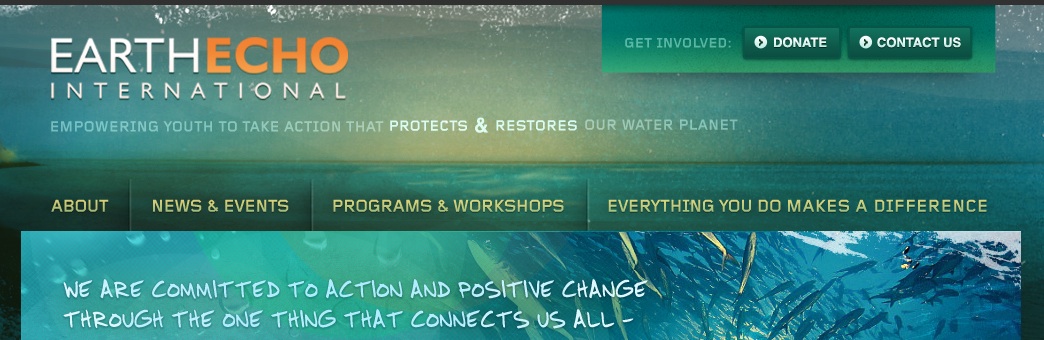
The EarthEcho International website effectively puts prioritization to work in the upper navigation. Note the distinction in importance between primary actions (Donating and Contacting) compared to the more general site content links (About, News & Events, etc.).
Visual Language
The Viget designed OPower website employs visual language in a number of playful and effective ways. I particularly like the selector on the Home Energy Reports page. The combination of descriptive labels and icons makes the interface more effective than if it relied solely on text.

Read the full article on UX Booth to find out more about this concept of differentiation in navigation and to see more examples, both good and bad.