Improve your site maps with page archetypes
Todd Moy, Former Senior User Experience Designer
Article Categories:
Posted on
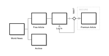
Here's a pretty typical site map: boxes and arrows, a decision point, and a conditional section. If you're the person who diagrammed it, you already have a good sense about how the system will work. You know the major interaction paths and what type of content will be present. You know the purpose for each of those pages.
Yet those generic little boxes betray that knowledge. To those who weren't part of the creation process, it takes a leap of faith (and a lot of questions usually) to really understand what is occurring. These boxes don't communicate the context of the interaction. The intent and purpose of each page is a bit nebulous.
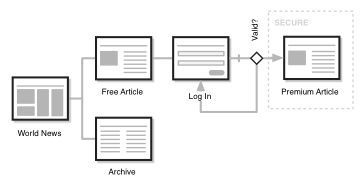
Page archetypes help you better express what's going on in your site maps and user flows.
Arche-what?
A page archetype is a picture. (Simple, eh?) More than that, however, they are generalizations of common behaviors we see in web applications. I like to think of them as the first point where content and interaction are unified. Roughly, they communicate the essence of the view--whether it's designed for interaction, consumption, navigation--and the manner content is presented.
Meet the Archetypes
Across all projects, I find that I can generalize to a few common points of interaction. There are views for reading long articles. Lists for archives. Doormat pages for categories. Forms for editing and submitting data. Now, this is not to suggest that there are no other forms of interaction, but it's surprising how easy it is to distill down to just a few basic types.
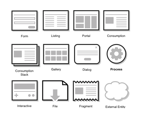
My "kit", shown above, contains just 12 different archetypes–a manageable number. Even with this variety though, 90% of the time I use just four types:
- Form: input/output interaction with a system. This could be a basic data entry form or something more AJAX-y.
- Listing: a view that presents many links to content, such as tag view, an archive, or search results. It's similar to a Portal, but this is usually more of a utility view.
- Portal: a view designed as an doormat for a collection of content. These are usually category pages that usher people deeper into a section. Compared to a Listing, this view is often more curated.
- Consumption: a view designed for extended reading, such as an article. Often this is presented as a stack to suggest lots of content that shares an identical form.
Occasionally, I'll extend this vocabulary to better describe the system. These I use judiciously because they can be too prescriptive of the implementation.
- Gallery: essentially the same as a listing, but represented as a grid.
- Dialog: a modal view. I use this when it's essential to describe an interaction that occurs within a certain page state.
- Process: a process that a user can't see, but whose operation is critical to the experience. A process that blocks for a long time before returning data is a good example.
- Interactive: a game-like or novel interactive experience. Usually the quality and nature of interaction is meaningfully different from a Form archetype.
- File: a physically downloadable file, like a PDF or an executable program
- Fragment: bits of consumable information on a page. I use this only when it's essential to document in-page content like lightboxes or tabs.
- External Entity: an object outside of the scope of the design, but whose presence needs to be accounted for. A direct mail campaign that drives users to the site would be a good example.
5 reasons why I use them
So, maybe you're thinking, "Why would I use these?" That's a question you can only answer for yourself -- but here are the top reasons I've stuck with them over the past few projects.
Reason 1: Improve readability
Archetypes make site maps more readable for others on the project. Documents start to reveal the context for interaction and the gestalt of the system. It's easier to envision a person moving through set of views.
Reason 2: A planning aid
They help me plan. As I move from fuzzy notions of content into physical formats, I better understand what is needed and how much effort that will incur. I can also zero in on what wireframes and design templates will be necessary.
Reason 3: Easy to draw
They're whiteboard-able. By using simple geometry, it's pretty easy for even non-artists to draw these. Giving non-designers an easy way to express themselves is a boon.
Reason 4: Force decisions
They force you to make decisions. Thinking nebulously about content and interaction is great for concept modeling, but my opinion is that site maps and flows should put stakes in the ground about views and content.
Reason 5: Not a paradigm shift
These play nicely with the Visual Vocabulary for IA, acting as an extension rather than an alternative. You can use the techniques you're familiar with.
Get a copy of the stencil
Want to try it out? Here are a couple of different formats for your site mapping pleasure. Big thanks to Mr. Steinruck for hooking up the EPS, PSD and AI formats!
Illustrator Symbols (.zip | 56k)
Photoshop Objects (.zip | 906k)
Parting thoughts
I'd be remiss not to mention that I lifted this idea from Information Architecture: Blueprints for the Web by Christina Wodtke and Austin Govella. The idea of archetypes seems like a subtext in that book and it's rarely discussed anywhere else. Kudos to them for sparking this idea.