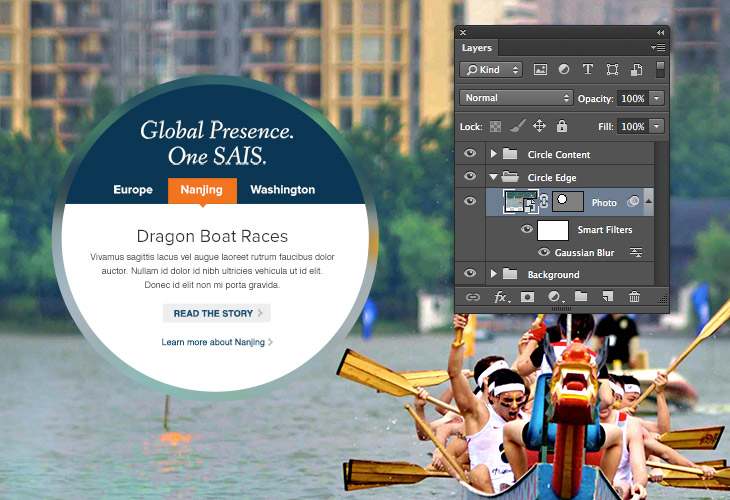
Frosted Glass Effect with Blur Filters and Masks

Combining a blur effect and a mask to achieve a frosted glass effect is fairly straightforward in Photoshop.
However, achieving this frosted glass effect on the front-end using using a single image file is a slightly different story. To produce this effect, we could use a CSS blur filter + CSS mask, but browser support at this time is poor. Using canvas could also work, but that would involve some JavaScript. Yet another option is good old SVG! It supports masks and filters, browser support is fairly good, plus it’s native HTML. That’s the solution I ended up turning to on a recent project.
The Main Background & Text Area
In this example, an image is used for the main background, and for the text area, we simply need an element that we can give a size, position and a generous border-radius.
<div class="feature">
  <img src="http://lorempixel.com/1000/600/city">
  <div class="text">
    Text
  </div>
</div>
.feature {
  position: relative;
}
.text {
  background: #fff;
  border-radius: 50%;
  height: 220px;
  left: 115px;
  padding: 75px;
  position: absolute;
  text-align: center;
  top: 115px;
  width: 220px;
}
The Frosted Glass Edge
Now for the fun stuff, the blurred frosted glass edging around the circle. This is where our SVG element comes into play. For this element, three pieces are required: an image, a blur filter and a mask. We’ll start with the image itself.
<div class="feature">
  <svg class="glass">
    <image id="svg-image" width="1000" height="600" xlink:href="http://lorempixel.com/1000/600/city" />
  </svg>
  ...
</div>
Within our SVG element, we’re specifying an image of the same size as the .feature container, positioned in the top left corner. Next the blur effect is added.
<div class="feature">
  <svg class="glass">
    ...
    <filter id="svg-blur">
      <feGaussianBlur stdDeviation="10" />
    </filter>
  </svg>
  ...
</div>
#svg-image {
  filter:url(#svg-blur);
}
The filter element is specifying a gaussian blur filter with a value of 10, and it is applied to the image element via. css. Finally, a mask is added to create the circle shape around the blurred image.
<div class="feature">
  <svg class="glass">
    <image x="0" y="0" id="svg-image" width="1000" height="600" xlink:href="http://lorempixel.com/1000/600/city" clip-path="url(#svg-mask)" />
    ...
    <clipPath id="svg-mask">
      <circle cx="300" cy="300" r="200" />
    </clipPath>
  </svg>
  ...
</div>
The clipPath element defines the mask, which in this case is simply a circle with a radius of 200px, at specific x and y coordinates, using the center of the circle as the reference point. It is applied to the image with the clip-path property.
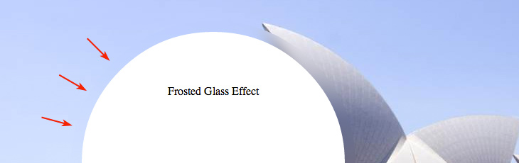
Offset Tweaks
Depending on the composition of the background image used, it may be hard to distinguish the edge of the frosted glass from the background image.
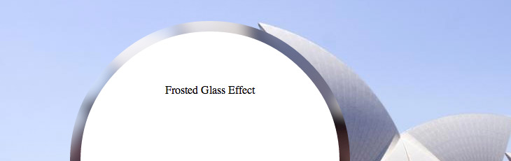
To give the frosted glass edge some definition against the background, we can offset the SVG image using a css transform. We’ll also need to offset the mask back into the correct position with another transform.
#svg-image {
  -webkit-transform: translate(-50px, -100px);
  transform: translate(-50px, -100px);
}
#svg-mask {
  -webkit-transform: translate(50px, 100px);
  transform: translate(50px, 100px);
}
Looking much better now.
IE Tweaks
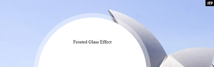
I mentioned earlier that browser support was fairly good (better than CSS filters and masks), but there are a few caveats with IE. While SVG support was added in IE9, support for SVG filters was not added until IE10. This example would look like the following in IE9:
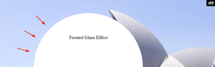
That could work, but it’s not quite the effect we’re going for. A good compromise is to simply hide the SVG image and use a semi-transparent white edge instead. IE9 supports rbga color so we can accomplish this quite easily by targeting an IE conditional class on the html tag or by using a Modernizr test for svg filter support:
.no-svgfilters #svg-image {
  display: none;
}
.no-svgfilters .text {
  border: 15px solid rgba(255,255,255,.4);
  background-clip: padding-box;
}
And there you have it, a frosted glass effect using a few little known features of SVG (full codepen below)! What other creative uses of masks and filters are out there? Let me know in the comments.