Color Contrast for Better Readability

Tom Osborne, Former VP, Design
Article Categories:
Posted on
Are you checking color contrast in your design for optimal readability? Learn more from @troz's simple method.

When you create color palettes for your web design projects, are you testing the color combinations for contrast? If you're not, you might not be considering the eventual readability of the design and thus losing potential audience.
I’ve been working on a process to help me ensure good color contrast and readability in my projects. Thanks to some helpful color contrast accessibility tools, I think I have something that is working and wanted to share with others in the event that you find it helpful, too.
I should mention that I’m far from an accessibility expert. My goal here is to simply show that a little bit of effort can go a long way when it comes to selecting colors with optimal readability in mind. Check out W3C for a more thorough explanation. Also, check out Contrast Rebellion for an interesting look at the contrast problem.
1. Establish a color palette (with tints, tones, and shades)
While you can use color contrast tools to help you establish a color palette, you can also use the tools to help find good options within an existing palette. In this case, I’m using a pre-existing color palette and showing how I'm using tints, tones, and shades to help create more color contrast options.

My working color palette. From previous article, Add Colors To Your Palette With Color Mixing.

Establishing tints, tones, and shades. From previous article, From Darkness to Light: Color Versatility Using Tints, Tones, and Shades.
2. Find a good color contrast analyzer
There are plenty of good color contrast testing tools available on the web. Find one that works for you and use it to test background and foreground color combinations. Here are some options:
- Colorable (Demo) by Brent Jackson (*new favorite* h/t @JimJones)
- Luminosity Colour Contrast Ratio Analyser by Juicy Studio
- Colour Contrast Check by Jonathan Snook
- Color Contrast Checker by WebAIM
- Check My Colours by Giovanni Scala
- Color Safe by Donielle Berg & Adrian Rapp
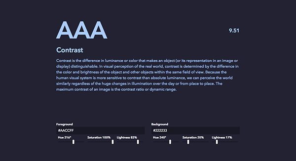
Brent Jackson's Colorable (Demo)
3. Examine body text contrast
First, it's helpful to establish good body text values. I usually start with a neutral color palette and aim for the lightest gray with a WCAG AAA (Section 508 compliant) rating. The AAA rating ensures optimal readability while some brightness allows for softness in the text. Note that the color names are custom names that I've assigned to the colors (from previous article, Giving Colors More Colorful Names.)
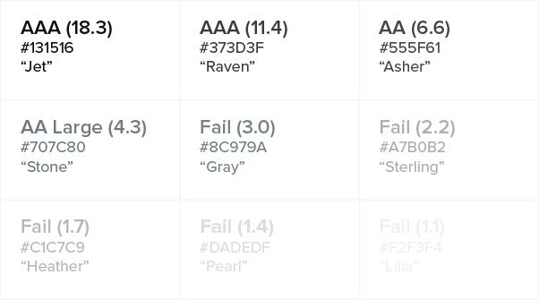
Testing a neutral color palette as text on a white background (from previous article: Shades of Gray — Yes, Really.)

#373D3F or "Raven" is my lightest gray within a AAA accessibility rating.
4. Evaluate button and link luminosity
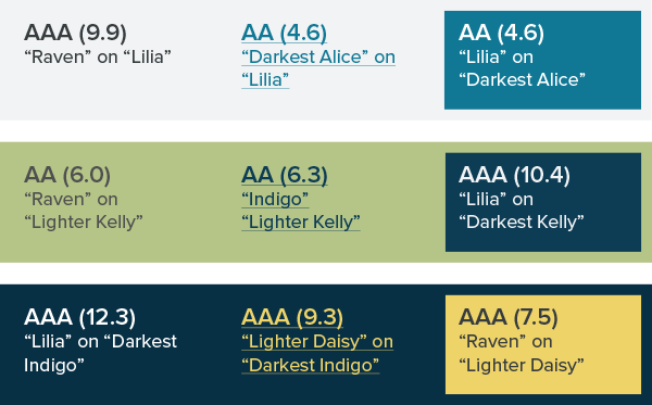
The next step is to find a good color option for buttons and links (the actions). I take a slightly different approach here. Instead of going for AAA, I’m looking for AA (a reasonable standard to strive for) so that I can get a brighter color to contrast from the static text and draw attention to important links. For these purposes, I'm testing white (#FFFFFF) in combination with various colors.
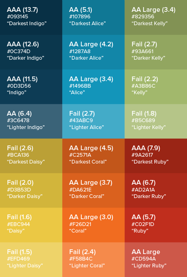
The blues and reds have a higher success rate while the yellows and greens not so much.
I go with "Darkest Alice" (#107896) for good combination of contrast and luminosity. "Ruby" (#C02F1D) is also a decent option.
5. Establish various color combinations
It’s good to identify some additional color combinations for attention-grabbing call-outs and other possible needs.
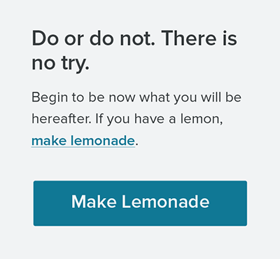
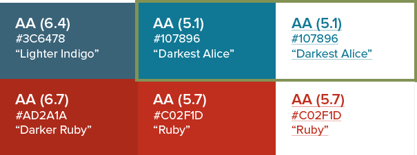
My base example with dark gray "Raven" text and a bright "Darkest Alice" blue for links and buttons.

Example with darks on a lighter background.

Example with lights on a darker background.
6. Document in your style guide
The last step is to keep a reference guide handy with your test results while adding notes to your style guide. Your clients and audience will be impressed that your colors are chosen for thoughtful reasons -- optimal readability -- and you'll sail through QA testing with additional options should you need them.
Sample documentation for a style guide.
Summary
That's really all there is to it, but you could break this down into three even simpler chunks if you like:
- Reading Text: For reading purposes, find a high contrast pairing for most of your body copy (the heavy lifting).
- Action Links: For links, explore colors that are both luminous and high contrast to make it clear where actions are. (If you've done this right, there will be some contrast between your reading text and action links.)
- Extra, Extra!: Create and document various color combinations for call-outs intended to draw extra attention.
See also:
Note: This article is part of a series on color as it relates to designing for the web. For more in the series, check out these articles:
- Using Word Association to Select Brand Colors
- Add Colors To Your Palette With Color Mixing
- Shades of Gray — Yes, Really
- Giving Colors More Colorful Names
- From Darkness to Light: Color Versatility Using Tints, Tones, and Shades
- Signal vs. Noise: Color as a Wayfinding Tool
- Using Visual Loudness for Better Wayfinding
- Design Systems at Viget